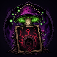
Shroom and Gloom art style: A Visual Breakdown of Its Layered Fungal World
Discover the Shroom and Gloom art style, from layered illustration and 3D spaces to lighting, card design, atmosphere, and readability.
Shroom and Gloom art style turns a card-based dungeon crawl into something illustrated, tactile, and slightly untrustworthy. Why does the Shroom and Gloom art style matter? Because it makes the game’s cards, rooms, enemies, and exploration systems feel like parts of one strange world instead of disconnected menus. Based on the official game description, developer material, and player experience from demo footage, the visual identity combines hand-drawn artwork, animation, layered depth, rich 3D environments, moody lighting, and bizarre fungal creatures.
The most useful way to understand the game’s presentation is not to ask whether it is “2D or 3D.” Instead, look at how those elements interact. The illustrations provide personality and texture, while the 3D spaces give the first-person exploration enough depth to feel like a journey through a physical place.
What Defines the Shroom and Gloom Art Style?
The Shroom and Gloom art style is best understood as a deliberate collision between illustrated fantasy and three-dimensional dungeon design. The official store description emphasizes drawn art and animations placed inside detailed 3D spaces, creating a surreal setting filled with mushrooms and madness.
Demo footage gives that description a practical meaning. One reviewer described the game as using multiple 2D layers to create a more three-dimensional look, with the overall presentation resembling a moving storybook or art book. That is player experience rather than an official technical label, but it explains why the game stands out so quickly in screenshots and videos.
| Visual ingredient | What the reference material shows | Why it matters |
|---|---|---|
| Illustrated artwork | Official descriptions emphasize hand-drawn visual elements and animation | Keeps the world expressive rather than generic |
| Layered presentation | A demo reviewer noticed separate 2D layers arranged to create depth | Makes rooms feel staged, almost like physical pages opening |
| Fungal subject matter | The setting focuses on monstrous mushrooms and surreal dungeon spaces | Gives the game a consistent visual theme |
| Lighting and color | Player experience highlights the lighting, while community reports mention colored environmental filters | Changes the mood and can affect visual contrast |
| Three-dimensional spaces | The official material describes numerous rich 3D areas | Prevents the game from feeling like a flat card menu |
This hybrid approach gives Shroom and Gloom a distinctive visual rhythm. The player can see the influence of traditional illustration in the outlines, creature designs, and card presentation, but the surrounding rooms still have enough depth to support first-person movement.
The result is more stylized than realistic. Players looking for photorealistic caves will find something very different, while anyone who enjoys illustrated horror, theatrical environments, or unusual indie game visuals may appreciate the contrast.
Animation is also important. Hand-drawn imagery can become static if it is used only as decoration, but movement helps the enemies and objects feel active. The official description specifically connects the drawn elements with animation, making the artwork part of the atmosphere rather than simply a collection of still images.
How the Visuals Serve Exploration and Combat
A strong art direction does more than create attractive screenshots. In Shroom and Gloom, the visuals support the game’s unusual double-deckbuilding structure.
The official description explains that players build two distinct decks. The combat deck is used during fights, while the explore deck helps with movement, searching, card modification, and unlocking new abilities. That division gives the visual design two jobs: it must make the rooms feel explorable and make the cards feel useful in the world.
Demo footage demonstrates this connection clearly. A shovel can be used to dig, a key can open a lock, and a lighter can interact with flammable objects. These are not merely battle effects hidden inside a menu. They are cards that influence how the player moves through the environment.
| Visual design choice | Gameplay connection | Example from the demo material |
|---|---|---|
| First-person room framing | Makes movement and discovery feel immediate | The player advances through connected dungeon spaces |
| Illustrated tool cards | Turns exploration actions into recognizable objects | Shovel, key, flashlight, and lighter cards |
| Separate combat presentation | Gives battles their own readable phase | Attack, skill, food, and effect cards appear during fights |
| Fungal enemy designs | Maintains the setting’s identity when combat begins | Players face strange mushroom-based creatures |
| Food and cooking imagery | Connects recovery and rewards to the world | Enemies can be roasted, eaten, or used in soups |
This connection between interface and environment is one of the game’s most interesting visual choices. A typical deckbuilder may keep its cards mostly inside combat screens. Shroom and Gloom instead makes the cards part of traversal, which means the player is constantly switching between reading artwork and reading the room.
The transition from exploration to combat also creates useful variety. The player may begin by examining a dark hallway, choosing a tool, or opening an obstacle, then suddenly face a group of fungal enemies. The presentation changes with the situation, but the same illustrated world remains visible throughout.
Why the Shroom and Gloom Art Style Makes Cards Feel Tangible
Card art can easily become a detached spreadsheet in a deckbuilder. Here, the Shroom and Gloom art style makes cards feel connected to the fiction by giving them clear names, actions, and consequences.
In demo footage, cards such as Rusty Shovel, Flashlight, Match Stick, Roast, Infected Limp, and Flambé suggest what the player can do before the effect is fully understood. Their names reinforce the setting’s mix of survival, exploration, cooking, and body-horror humor.
The cards also communicate that the two decks are not interchangeable. Exploration cards help the player navigate or manipulate the dungeon, while combat cards are focused on attacking, healing, applying effects, or creating combinations. The visual distinction is therefore important for both theme and usability.
| Card role | What it contributes visually | Practical reading tip |
|---|---|---|
| Exploration tool | Looks and behaves like an object used in the dungeon | Save tools for obstacles you cannot bypass another way |
| Combat attack | Establishes the immediate action of a battle | Check enemy traits before spending a high-damage card |
| Skill or mood card | Suggests preparation, modification, or setup | Consider how it improves the next few plays, not only the current turn |
| Food or edible card | Links healing, rewards, and the game’s cooking theme | Avoid adding too many consumables if they crowd out essential cards |
| Foresight or passive choice | Represents a longer-term advantage | Compare the benefit over an entire run instead of one encounter |
The food system is especially effective from a visual and thematic perspective. Official material explains that players can season, roast, and eat enemies to restore health, then use roasted foes in soups. That is an unusual alternative to the standard defensive mechanics found in many deckbuilders, and it gives the game a memorable identity.
Community reports: Card readability has been a concern for some players. One colorblind player reported difficulty distinguishing exploration and combat cards, particularly when rarity colors and environmental lighting overlapped. Another player noted that later Steam demo updates appeared to add clearer category signals and distinctive corner markings.
Those comments describe specific demo versions and should not be treated as a universal assessment of the current build. Still, they highlight an important design challenge: an attractive card needs to remain legible when it is viewed in a dim room, during a busy combat, or among several similar effects.
The Mood: Surreal, Grotesque, and Unexpectedly Playful
The Shroom and Gloom art style is not only gloomy. Its visual identity works because it balances danger with absurdity.
The official descriptions present a surreal world of mushrooms and madness, while the demo footage adds campfires, food, cooking, odd card names, and enemies that can become ingredients. That contrast creates a form of dark humor. The world can look threatening one moment and strangely funny the next.
| Mood | Source-based visual cue | Likely effect on the player |
|---|---|---|
| Unease | Dark tunnels, threatening encounters, and changing room conditions | Encourages careful movement and inspection |
| Surrealism | Mushroom creatures, unusual objects, and exaggerated card effects | Makes the setting feel dreamlike rather than realistic |
| Grotesque humor | Roasting and eating enemies as part of recovery | Softens the horror with absurdity |
| Wonder | Layered spaces, illustrated details, and animated environments | Rewards players who pause to examine the room |
| Pressure | Environmental danger and limited resources | Makes the attractive setting feel hostile rather than decorative |
Player experience: Demo reviewers praised the enemy designs and the visual layers, while community reports described the overall aesthetic as fresh. One community commenter compared the atmosphere to Darkest Dungeon. That is a player comparison, not evidence that the developers directly copied or took inspiration from that game.
The comparison is still useful for setting expectations. Shroom and Gloom appears to favor high-contrast fantasy atmosphere and unsettling creature design over clean, bright, minimalist visuals. Its humor does not remove the danger; it makes the danger feel stranger.
The visual tone also helps the game’s cooking mechanics feel less ordinary. Roasting an enemy would be a standard damage effect in another game, but here the artwork and setting turn it into part of the world’s logic. The player is not simply collecting health points. They are scavenging, seasoning, and turning monsters into resources.
How to Experience the Shroom and Gloom Art Style in the Demo
To judge the visuals fairly, do more than look at a single screenshot. The most impressive part of the presentation is the way the layers, cards, lighting, and animation work together during play.
The official Steam listing is the best place to check current screenshots, features, and release information. As of September 4, 2026, the listing gives September 10, 2026, as the planned Early Access date, so visual details and interface elements may continue to change.
Use this short checklist when examining the demo or current footage:
| Step | What to do | What to look for |
|---|---|---|
| 1. Pause at a room entrance | Look beyond the card hand | Identify foreground, background, lighting, and depth layers |
| 2. Use an exploration card | Try a tool on an object | Notice whether the card action feels connected to the environment |
| 3. Compare different rooms | Observe changes in color and illumination | See how the mood shifts without changing the overall art direction |
| 4. Enter a combat encounter | Compare the battle view with exploration | Check whether enemies and cards retain the same visual identity |
| 5. Inspect card categories | Sort or review the available cards | Test whether deck type and card function are easy to distinguish |
A few practical questions can make the evaluation more useful:
- Do the illustrations remain recognizable when several cards are in your hand?
- Do animations add information, or are they mainly decorative?
- Does the room lighting improve atmosphere without hiding important objects?
- Can you tell an exploration card from a combat card quickly?
- Do enemy designs make you curious about their abilities?
Community reports: Performance feedback has been mixed. Some players praised the presentation, while others reported that the demo ran hot or struggled on particular computers. A developer response on the project page suggested lowering resolution and disabling ambient occlusion as possible ways to improve frame rate. These are troubleshooting suggestions, not guaranteed fixes for every system.
Bottom line
Overall, the Shroom and Gloom art style succeeds because it connects the game’s visual layers to its mechanics. The illustrations give the cards and enemies personality, the 3D spaces make exploration feel physical, and the lighting helps the fungal world feel unstable and atmospheric.
It is not simply a flat deckbuilder with a dungeon background. The cards influence movement, the rooms frame decisions, and the enemy designs support a setting where combat, cooking, and survival share the same bizarre visual language. If you enjoy unusual indie art direction and are comfortable with grotesque but playful imagery, the game’s presentation is one of its strongest reasons to pay attention.
FAQ: Shroom and Gloom Art Style
Is Shroom and Gloom a 2D or 3D game?
It uses a hybrid presentation. The game combines illustrated 2D artwork and animation with detailed 3D spaces. A demo reviewer specifically noted that layered 2D elements create a stronger sense of depth, so the game does not fit neatly into only one visual category.
What makes the Shroom and Gloom art style different from a standard card game?
Cards are used for more than combat. Exploration cards can help the player move, search, unlock objects, or interact with the dungeon, while combat cards handle attacks and effects. This makes the visual identity part of the exploration loop instead of limiting it to the battle interface.
Do community reports mention visual readability issues?
Yes. Community reports include feedback from a colorblind player who found it difficult to separate exploration and combat cards in some demo versions. Later comments reported clearer corner markings and category indicators in an updated Steam demo, but the exact interface can change between builds.
Where can I see the current artwork and release information?
The official Shroom and Gloom Steam page includes the current feature description, screenshots, system information, and planned release details. It is the most reliable place to check how the game’s presentation develops before Early Access.
Related Guides
Shroom and Gloom art: A Visual Guide to Fungal Dungeons, Cards, and Monsters
Explore Shroom and Gloom art, from hand-drawn imagery and dungeons to rich 3D spaces, fungal foes, and the official gallery before Early Access.
Shroom and Gloom gameplay guide: Master the double-deck dungeon crawl
Explore Shroom and Gloom gameplay with a practical guide to its two decks, fungal combat, card growth, food healing, demo status, and beginner strategy.
Shroom and Gloom Logo: Where to Find Official Game Branding and Use It Safely
Looking for the Shroom and Gloom logo? Learn how to verify official assets, distinguish key art from branding, and use images responsibly.
Shroom and Gloom music: What’s Confirmed About the Soundtrack and Atmosphere
Looking for Shroom and Gloom music? Here’s what the official listings confirm about audio, atmosphere, release timing, and soundtrack updates.